YourShoes, an affordable shoe store, caters to a user demographic typically aged between 22 and 45, with a majority being working adults.
The store requires a well-designed return and exchange flow, as a confusing process may potentially reduce client conversion rates and erode trust in the brand.
Craft a user-friendly home page and return/exchange flow, ensuring clear navigation and a seamless experience.
UX designer (generalist) designing website from conception to delivery.
Conducting interviews, paper and digital wireframing, low and high fidelity prototyping, conducting usability studies, accounting for accessibility, iterating on designs and responsive design.
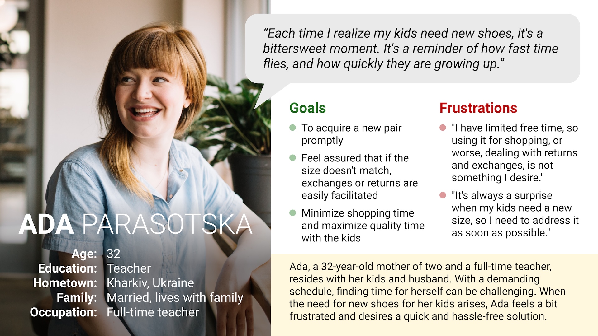
I conducted interviews and created empathy maps to understand the users I’m designing for and their needs. A primary user group identified from the research was working adults who buy shoes for season or for events. This group confirmed assumptions about the main website user.
Another group comprises parents who frequently need to acquire new pair of shoes for their kids promptly and stress-free due to the rapid growth of children. Addressing the needs of this group will enhance the overall experience for all customer segments.
Most users prefer not to invest much time in shopping; they aim to make the perfect choice quickly.
When users realize they've made the wrong choice, it becomes stressful. Therefore, a poor or complex solution flow can erode trust.
Ada, a teacher and mother of two, seeks a quick and stress-free solution to purchase new shoes for herself and her kids.
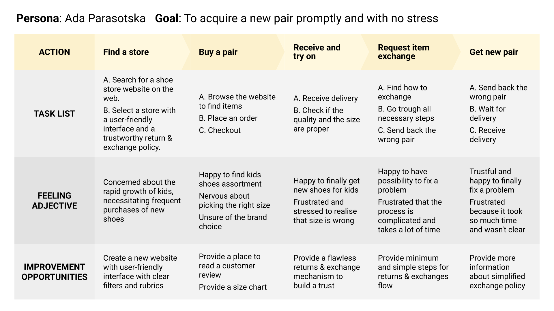
Mapping Ada’s user journey revealed how helpful it would be for users to have flawless returns & exchanges flow.
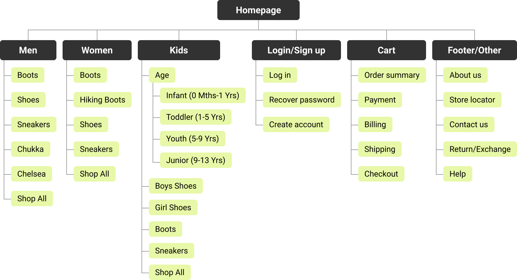
Difficulty with website navigation was a primary pain point for users, so I used that knowledge to create a sitemap.
My goal here was to make strategic information architecture decisions that would improve overall website navigation.
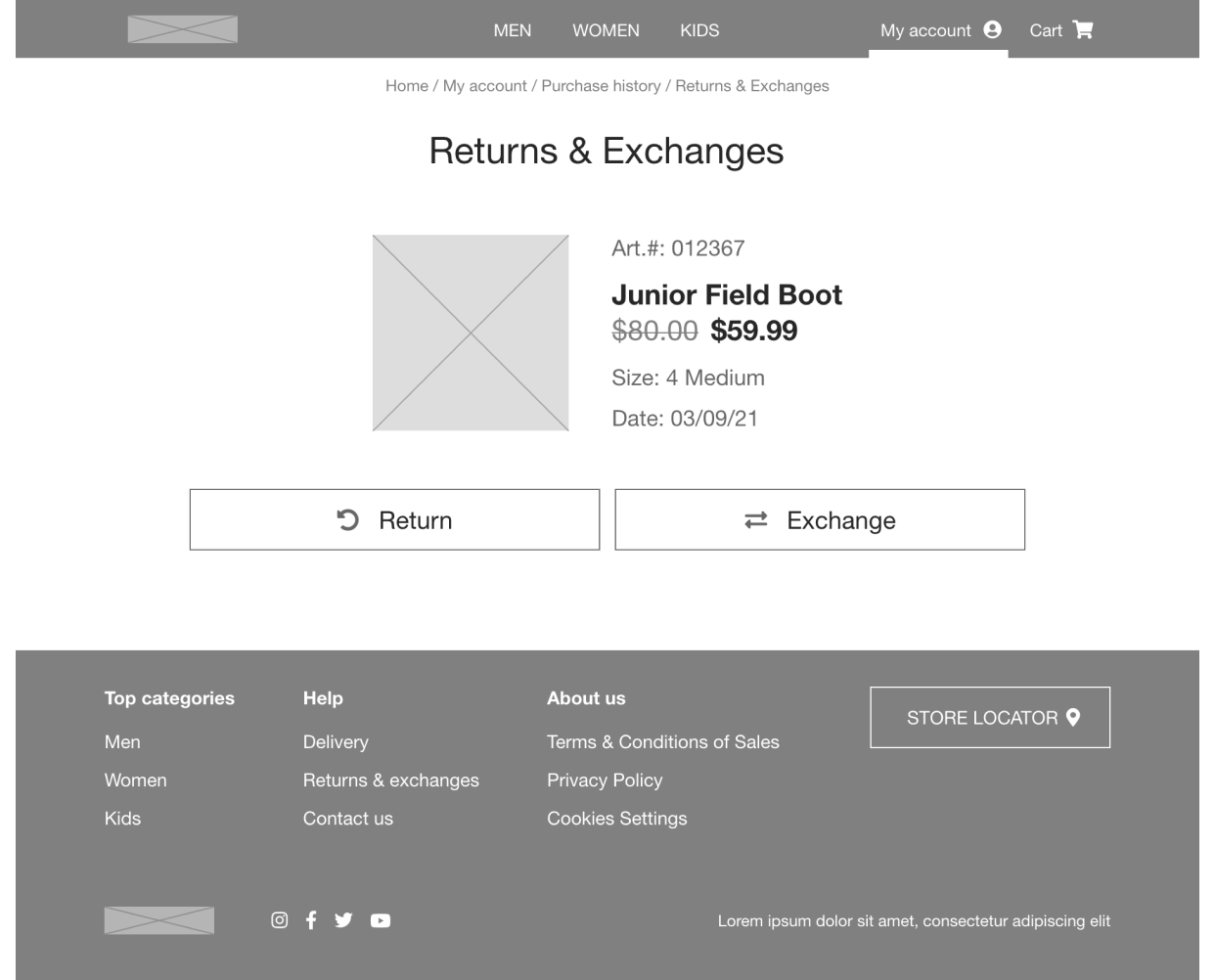
Subsequently, I drafted paper wireframes for each screen, addressing user pain points related to navigation, browsing, and the checkout flow.
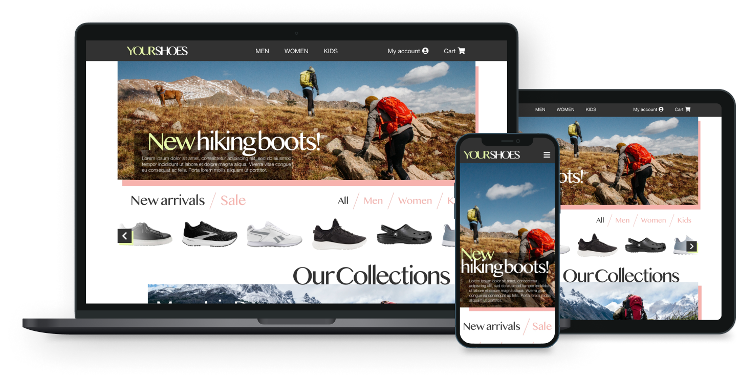
Given that YOURSHOES customers use a variety of devices, I initiated the design for additional screen sizes to ensure full responsiveness of the site.
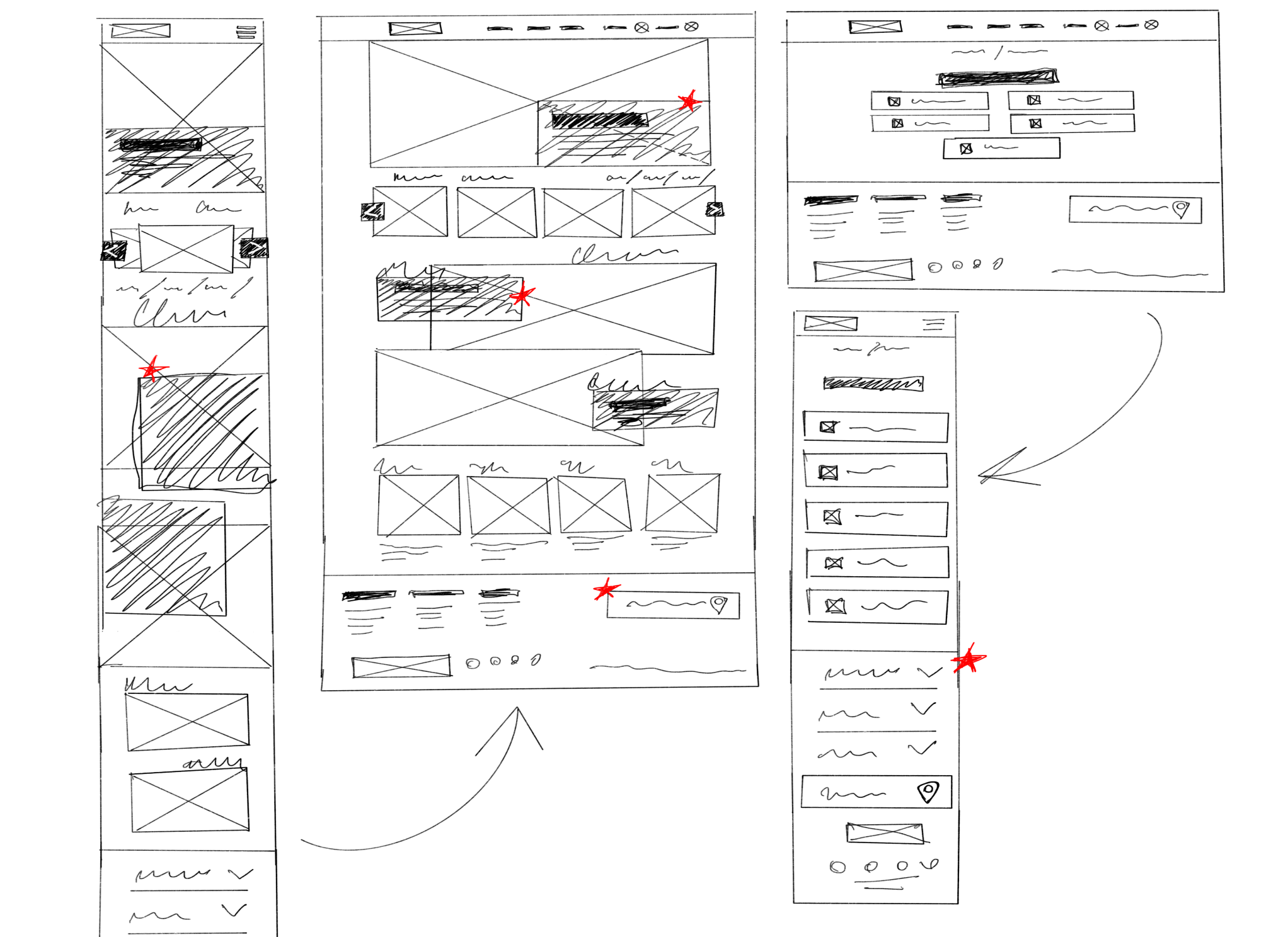
Transitioning from paper to digital wireframes clarified how the redesign could effectively address user pain points and enhance the overall user experience.
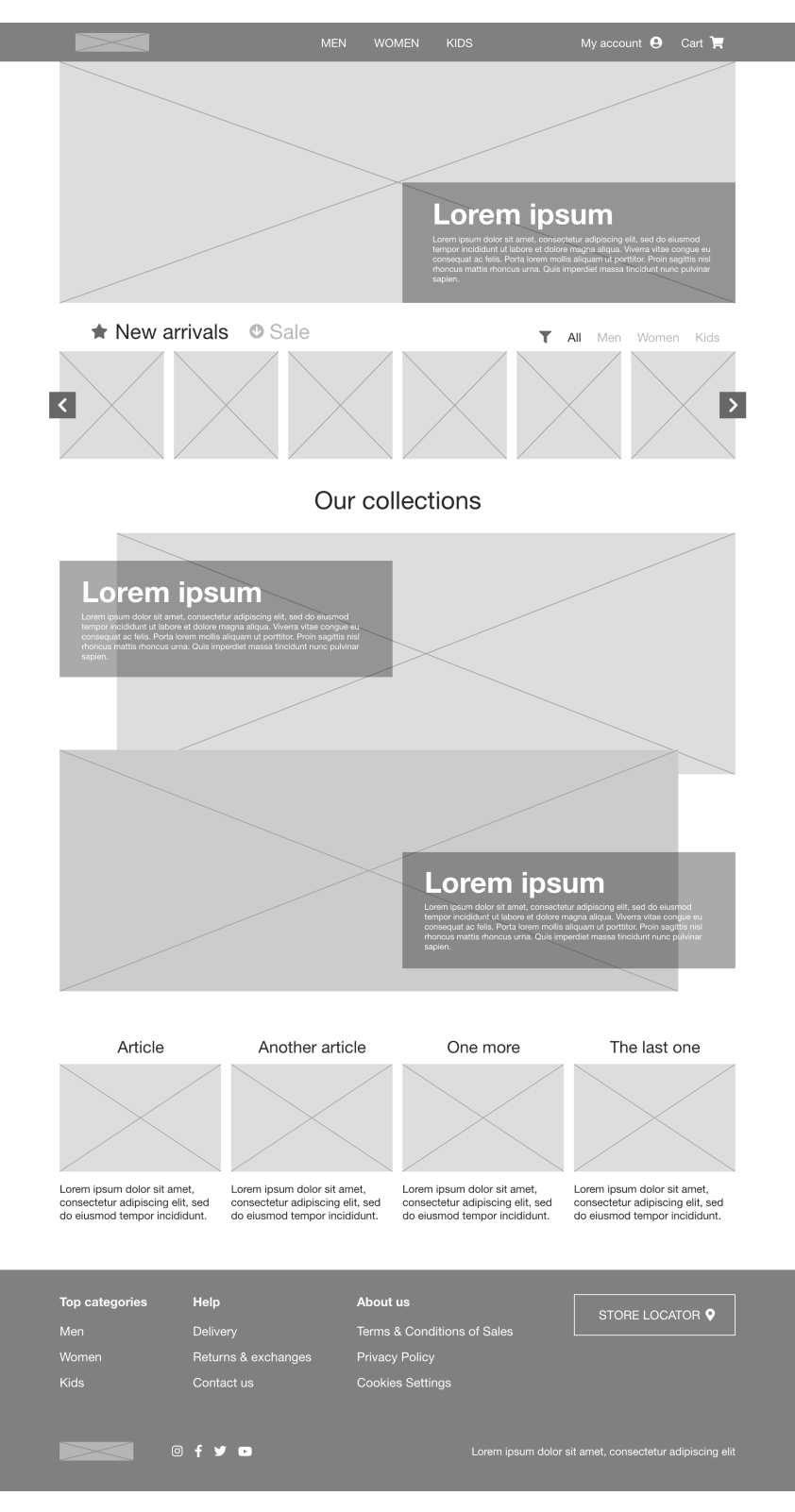
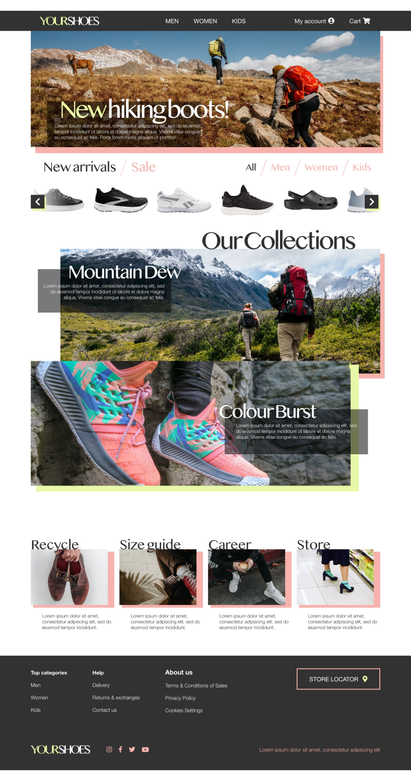
A key aspect of my strategy was prioritizing optimal button locations and visual element placements on the home page.
To create a low-fidelity prototype, I linked all screens associated with the returns & exchanges user flow.
Having received feedback from my team regarding aspects such as button placement and page organization, I actively incorporated their suggestions, focusing on addressing user pain points.
Lo-fi prototype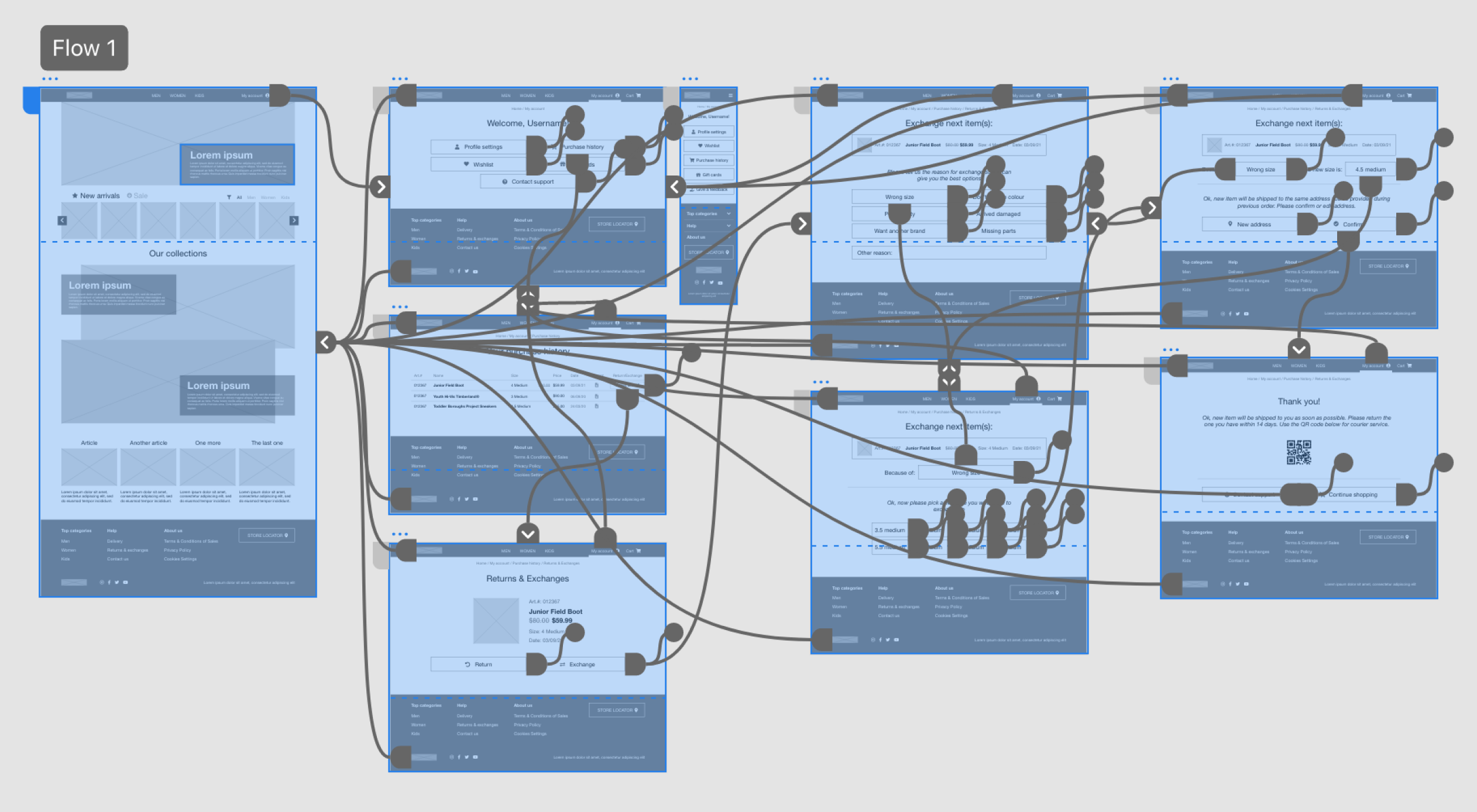
Unmoderated usability study
Sweden, Stokholm, remote
5 participants
20-30 minutes
Initiating the returns & exchanges flow proved challenging to locate
Users need to be aware of the remaining days for returns/exchanges to alleviate stress
Rather than typing the reason, offering predefined options for selection is preferable
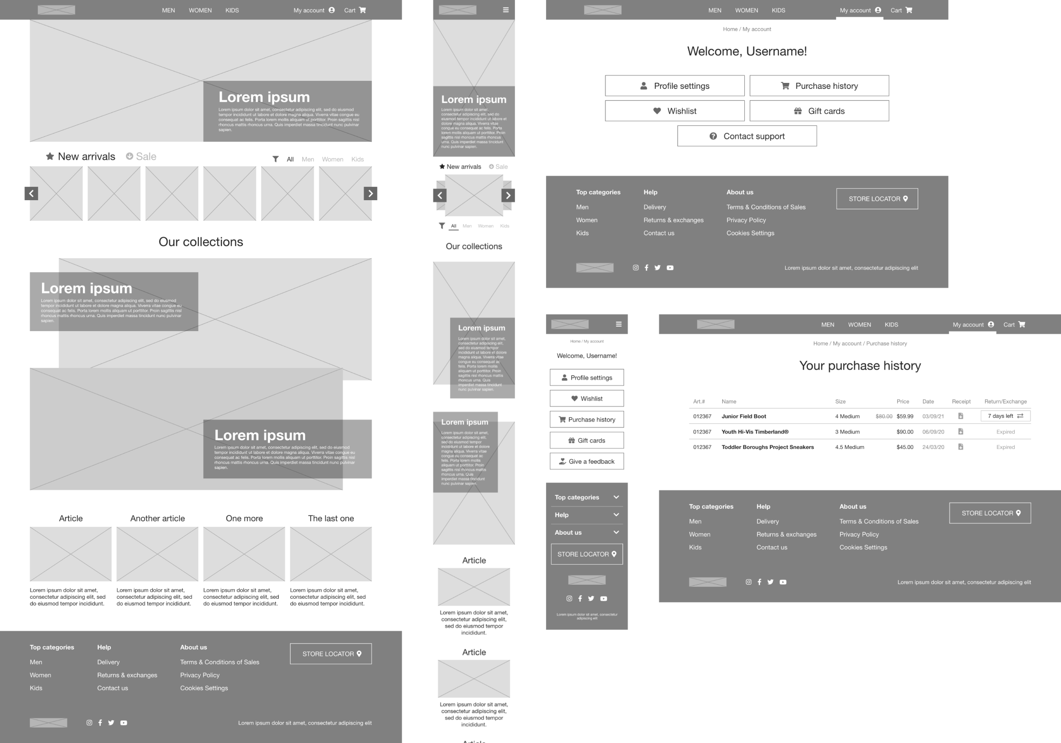
After optimization based on usability study results next step was to create hi-fidelity mockups of the home page and returns & exchanges flow.
Defined voice and tone, typeface and brand colours, used stock images to give it the closest to reality look.
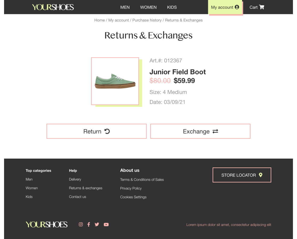
Incorporated every screen of the returns & exchanges flow in high fidelity to furnish comprehensive information for further development.
I included different screen sizes in my designs, building on my initial sketches. Knowing that users shop from various devices, I made sure to improve the browsing experience for different screen sizes, like mobile and tablet, for a smoother overall experience.
My high-fidelity prototype adhered to the same user flow as the low-fidelity version, incorporating both the design changes implemented after the usability study and several additional modifications suggested by my team.
Hi-fi prototype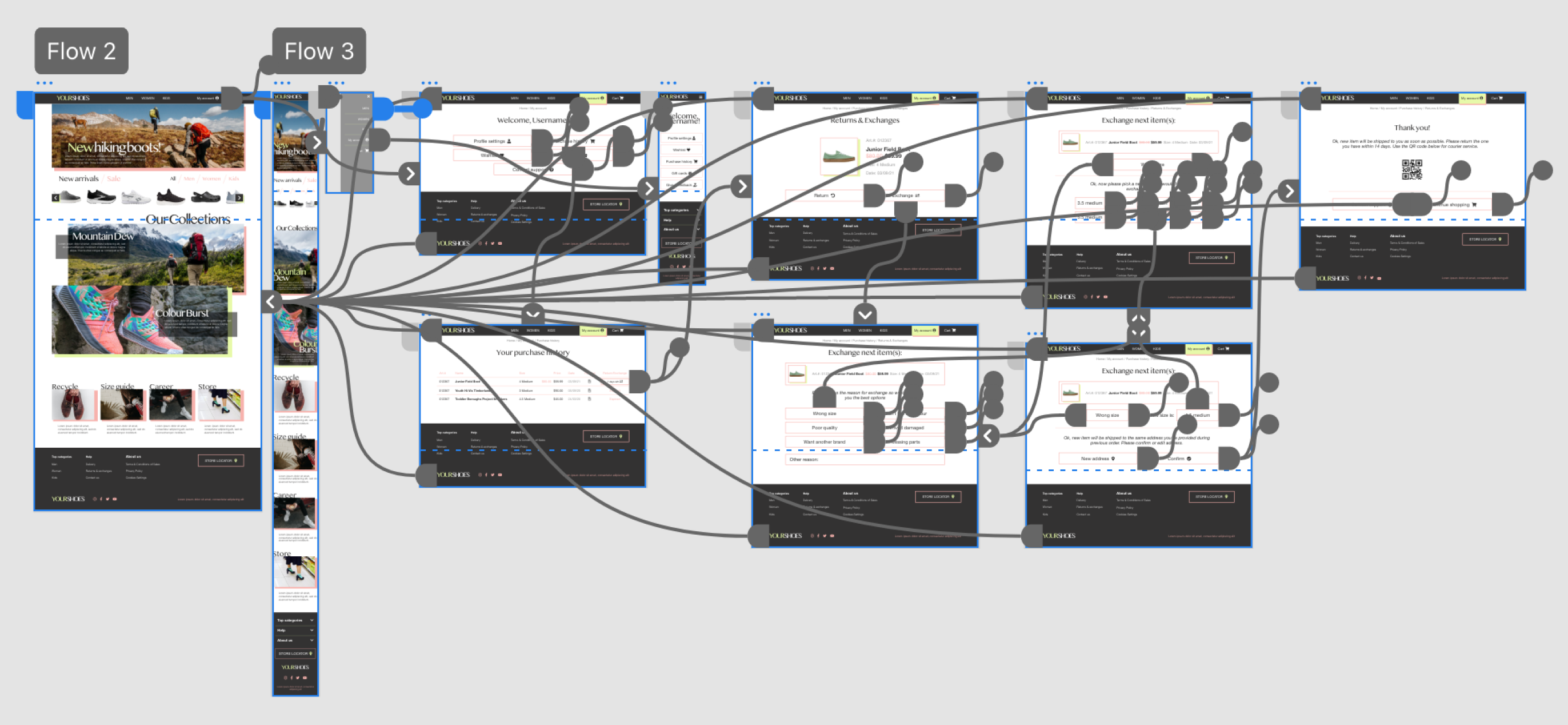
Employed varied text sizes in headings to establish a clear visual hierarchy.
Used landmarks to help users navigate the site, including users who rely on assistive technologies
The site designed with accessible alt text on every page, ensuring a smooth experience for screen reader users.
Our target users expressed that the design exhibited intuitive navigation, enhanced engagement with images, and demonstrated a clear visual hierarchy.
I discovered that even minor design changes can significantly impact the user experience. My key takeaway is always prioritizing the genuine needs of the user when generating design ideas and solutions.
Conduct follow-up usability testing on the new website.
Identify any additional areas of need and ideate on new features.
Thank you!